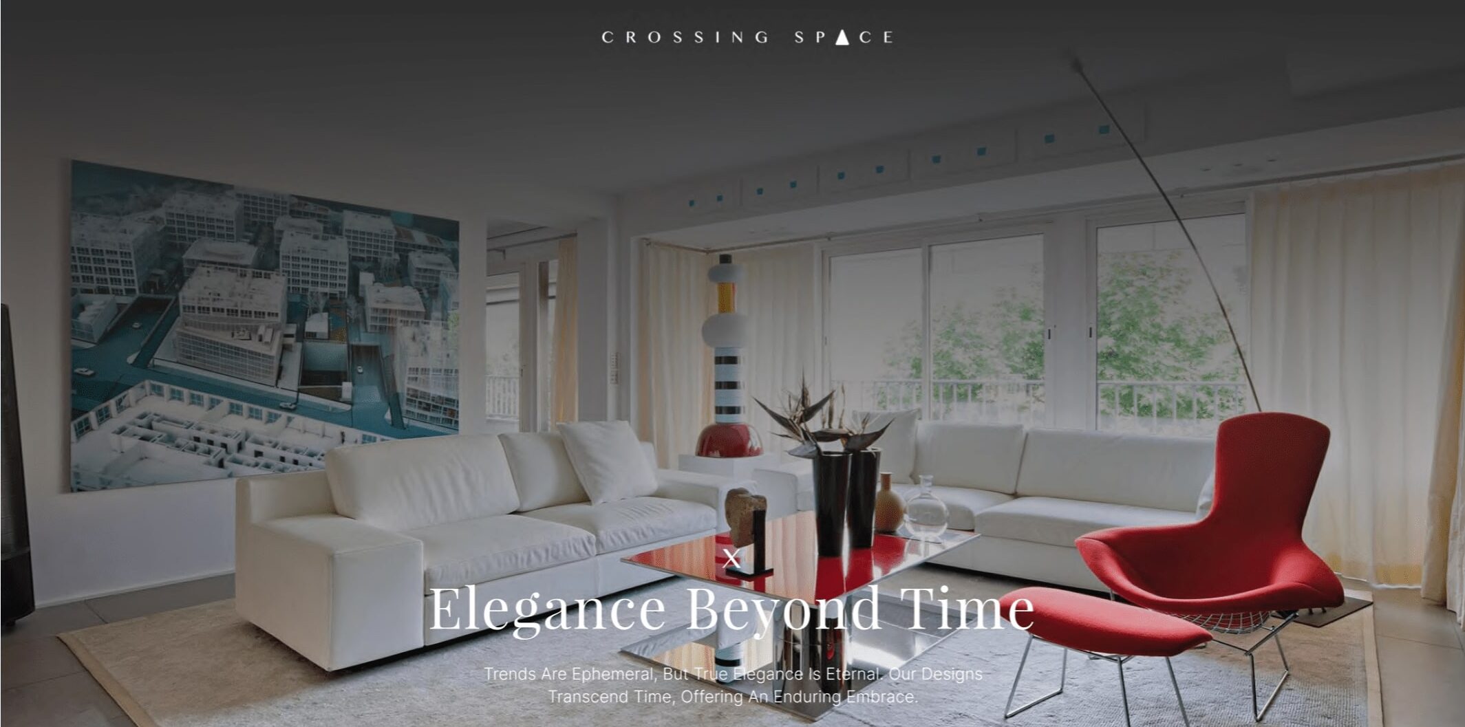
Web Design – Furniture Display
Crossing Space
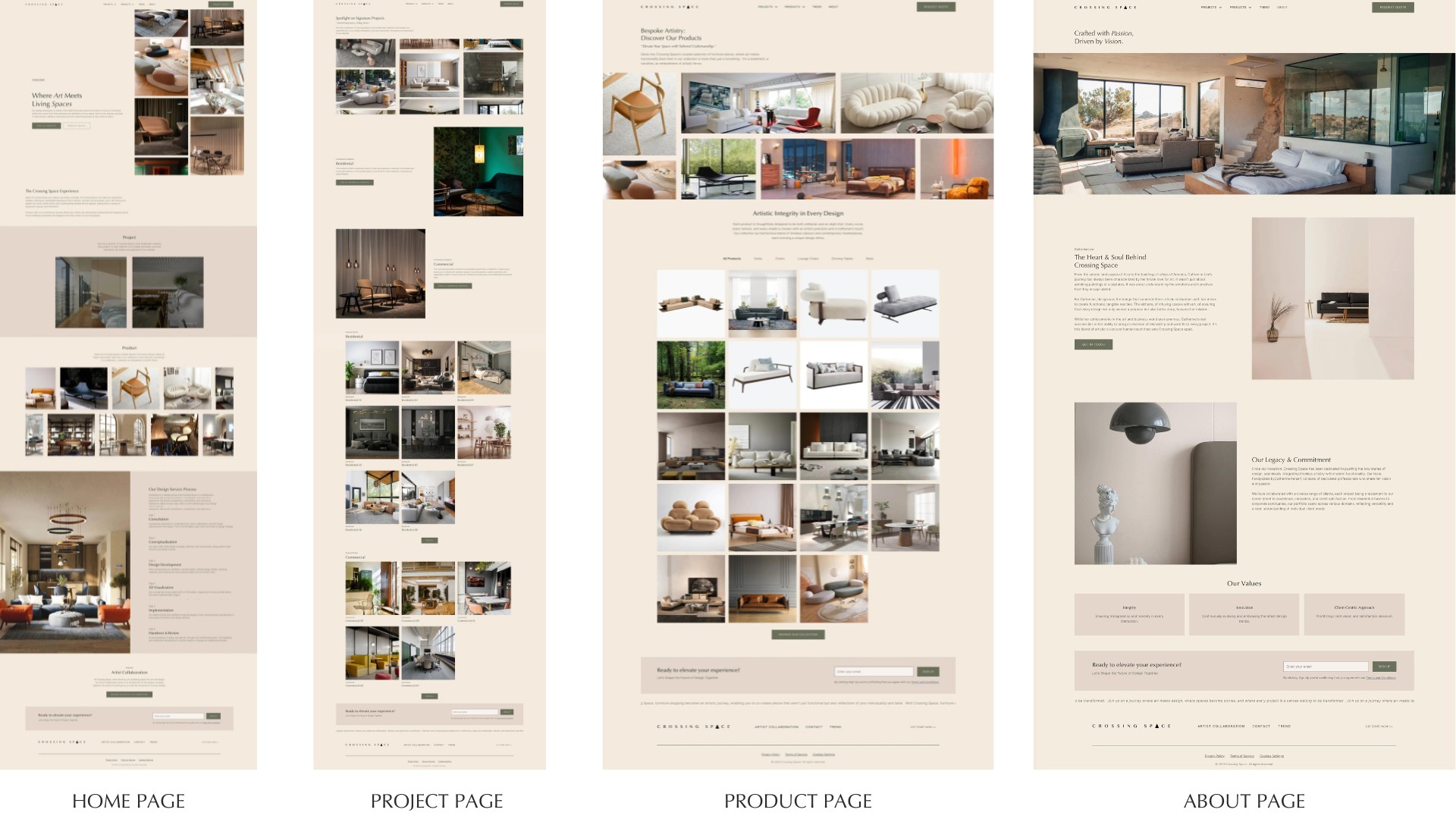
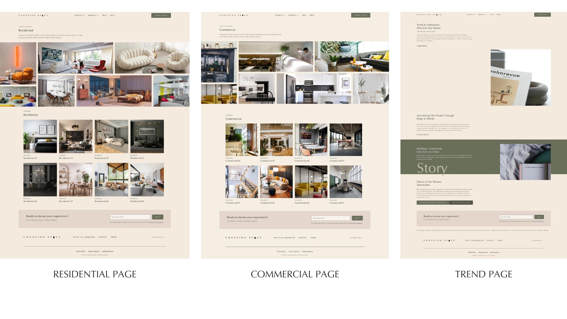
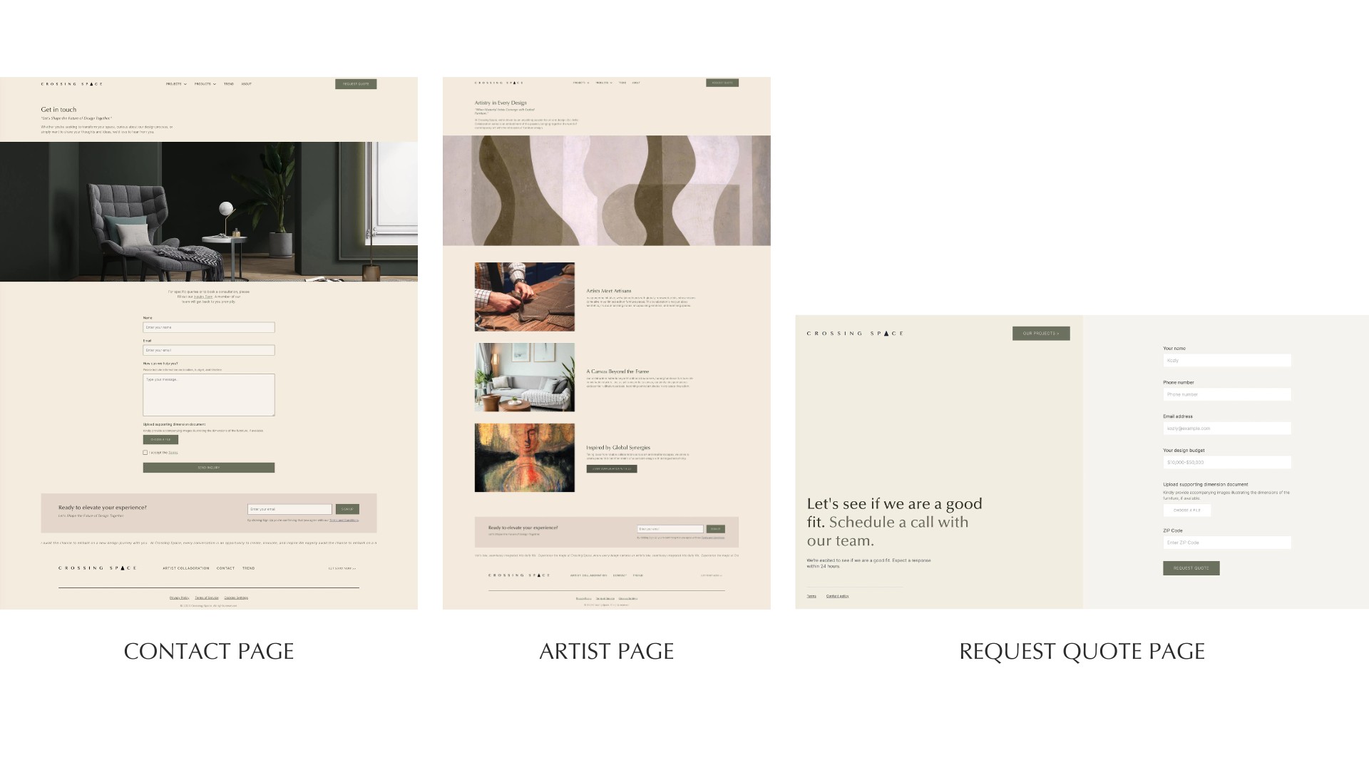
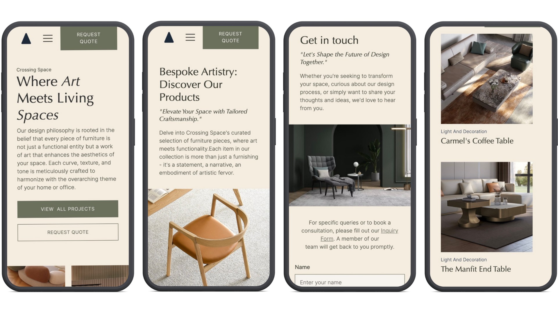
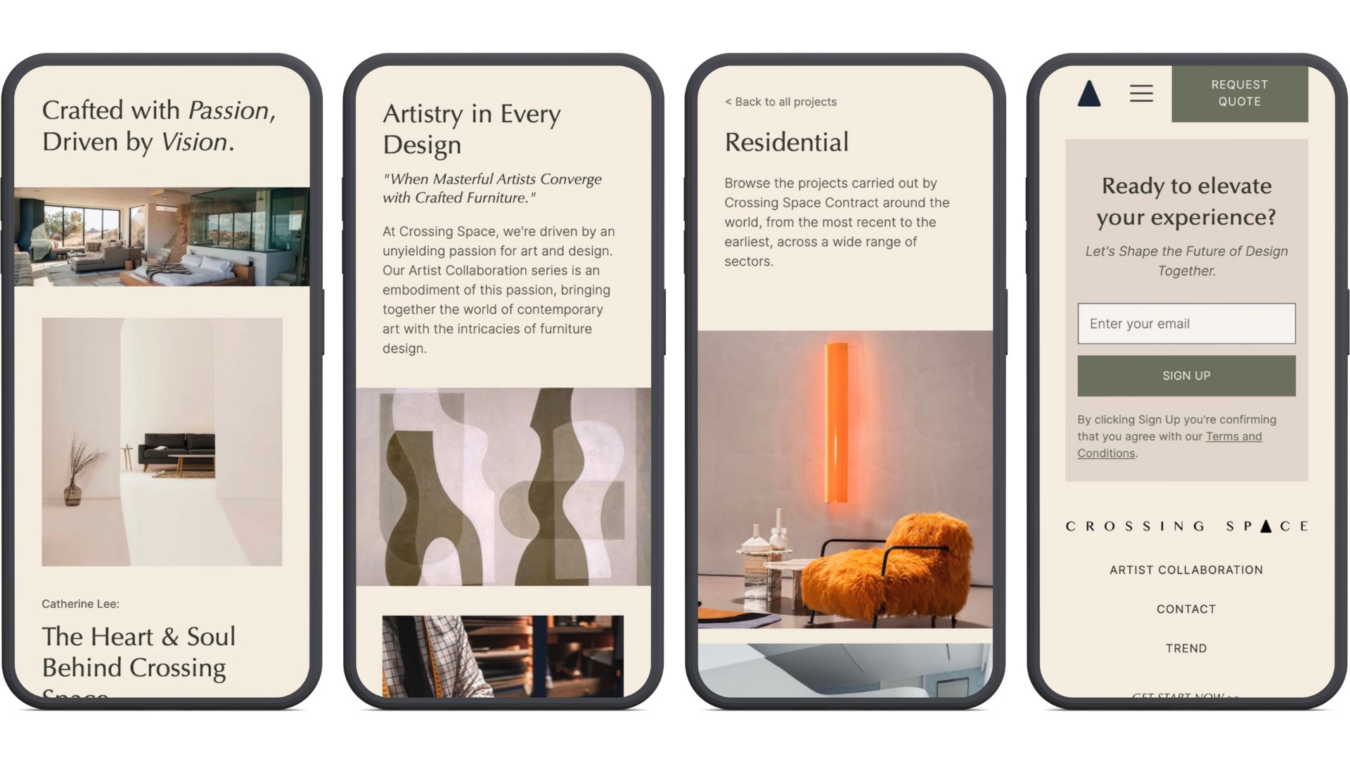
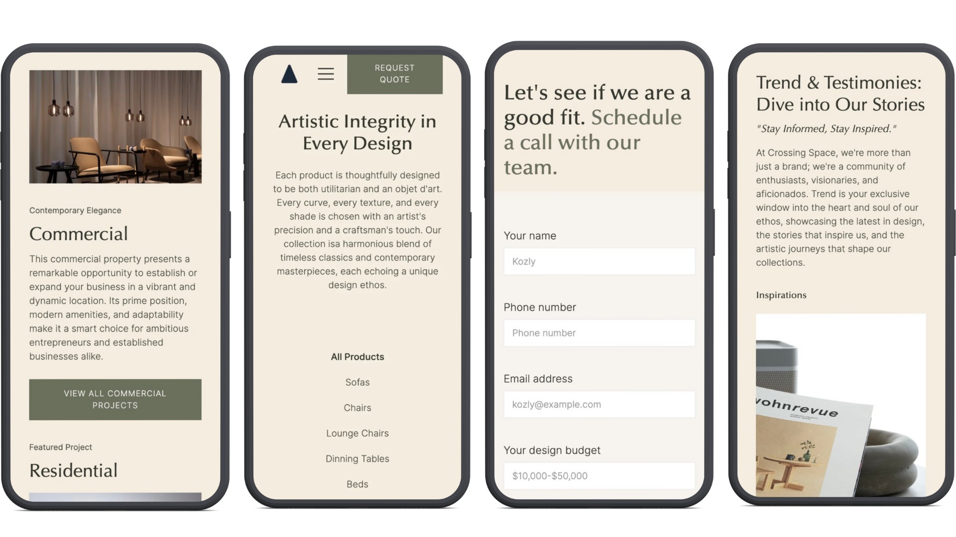
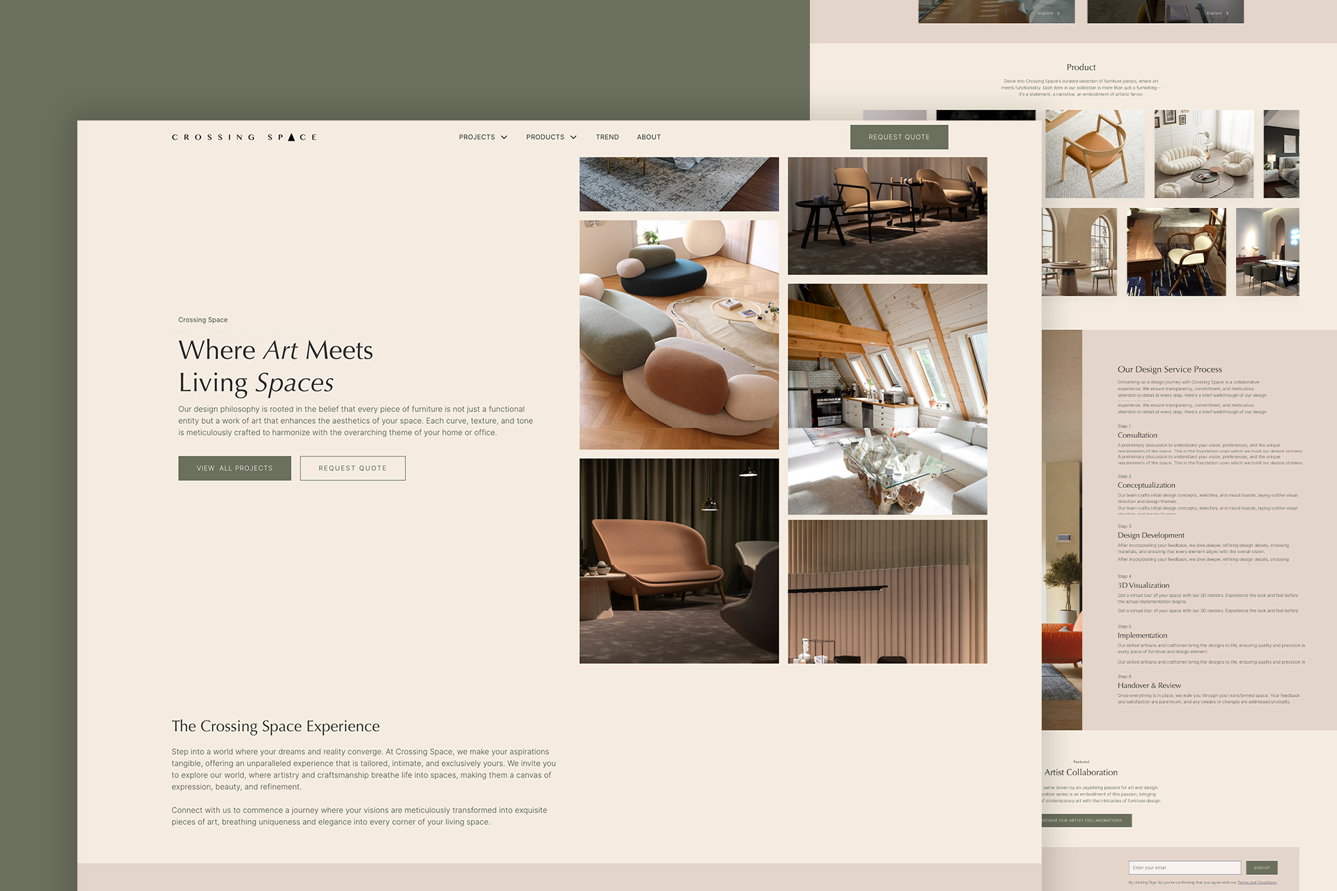
Crossing Space is a responsive high-end furniture display site. This project highlights my work on designing and developing an artistic, minimalist, and user-friendly website for a high-end furniture brand. My goal is to create a simple navigation structure, incorporating search capabilities so users can easily find specific furniture pieces or categories. Ensuring the site is responsive across various devices and screen sizes for seamless access was also a top priority.
Software: Figma, Webflow.
Design Problem
Project Objectives:
The client has resources to connect furniture factories in China with the USA. They want to start with a journal-styled furniture display website, transitioning to e-commerce later, with a clean and minimal aesthetic. They need a balance between e-commerce’s verbose content and the simplicity of an information display site.
The website should allow for easy hiding and revealing of e-commerce features and be scalable for future updates and expansions. It should also aim to offer a simple navigation structure, implementing search capabilities to enable users to easily find specific furniture pieces or categories. Additionally, to ensure responsiveness across various devices and screen sizes for seamless access is a key point.
Background research:
Communicate with client to figure their aesthetic preferences, latest industry trend, their competitive brand differences compared to other competitors, create a moodboard, sitemap and low-fi prototype in Figma.
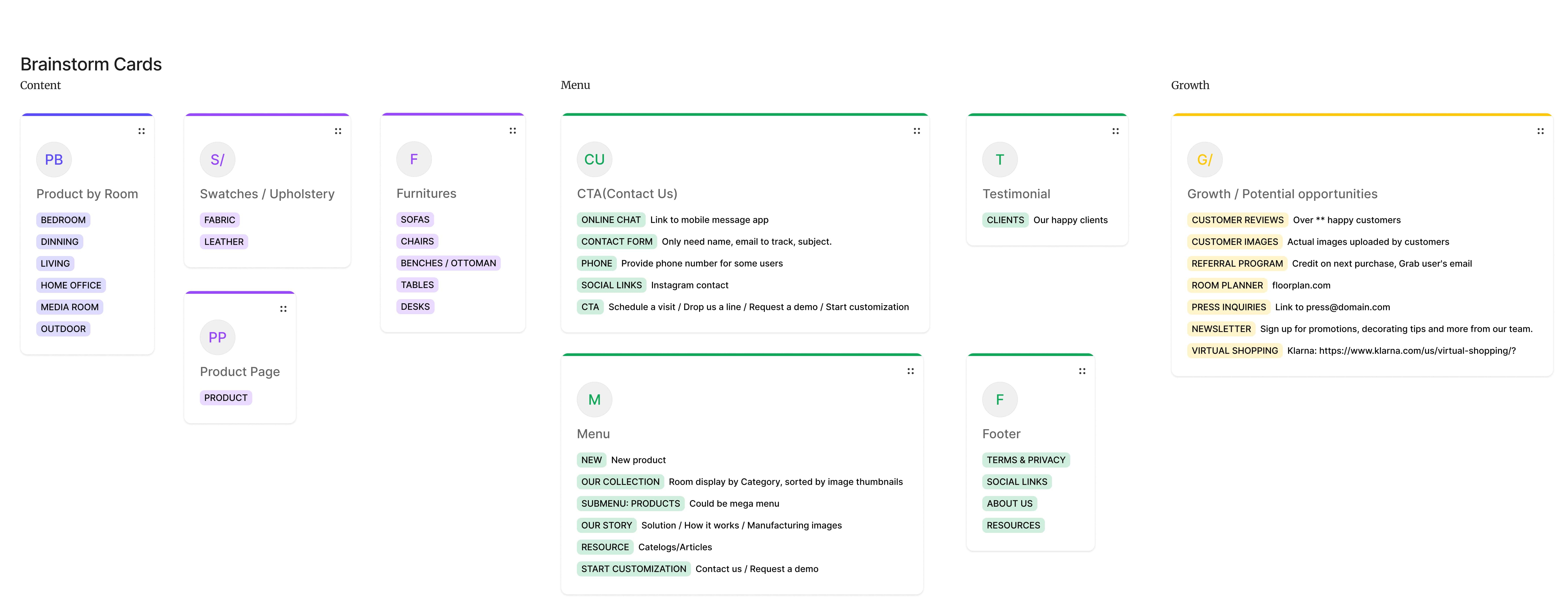
Brainstorm Cards:
According to client’s vision, I brainstormed categories of product by room, by furnitures and by upholstery. summarized the call-to-action, and menu. I also think about the growth strategy / potential opportunities for the future of web dev.
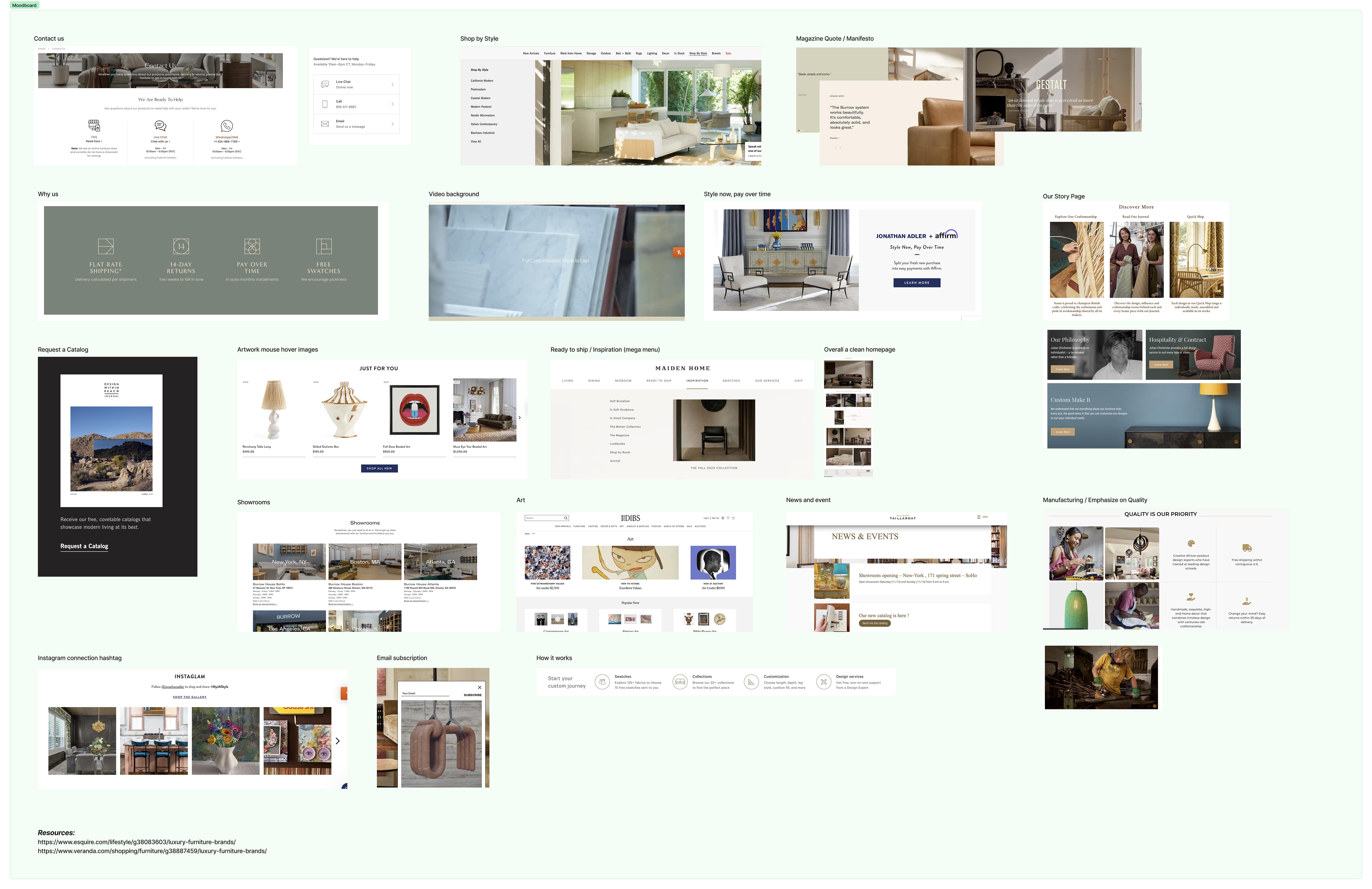
Moodboard:
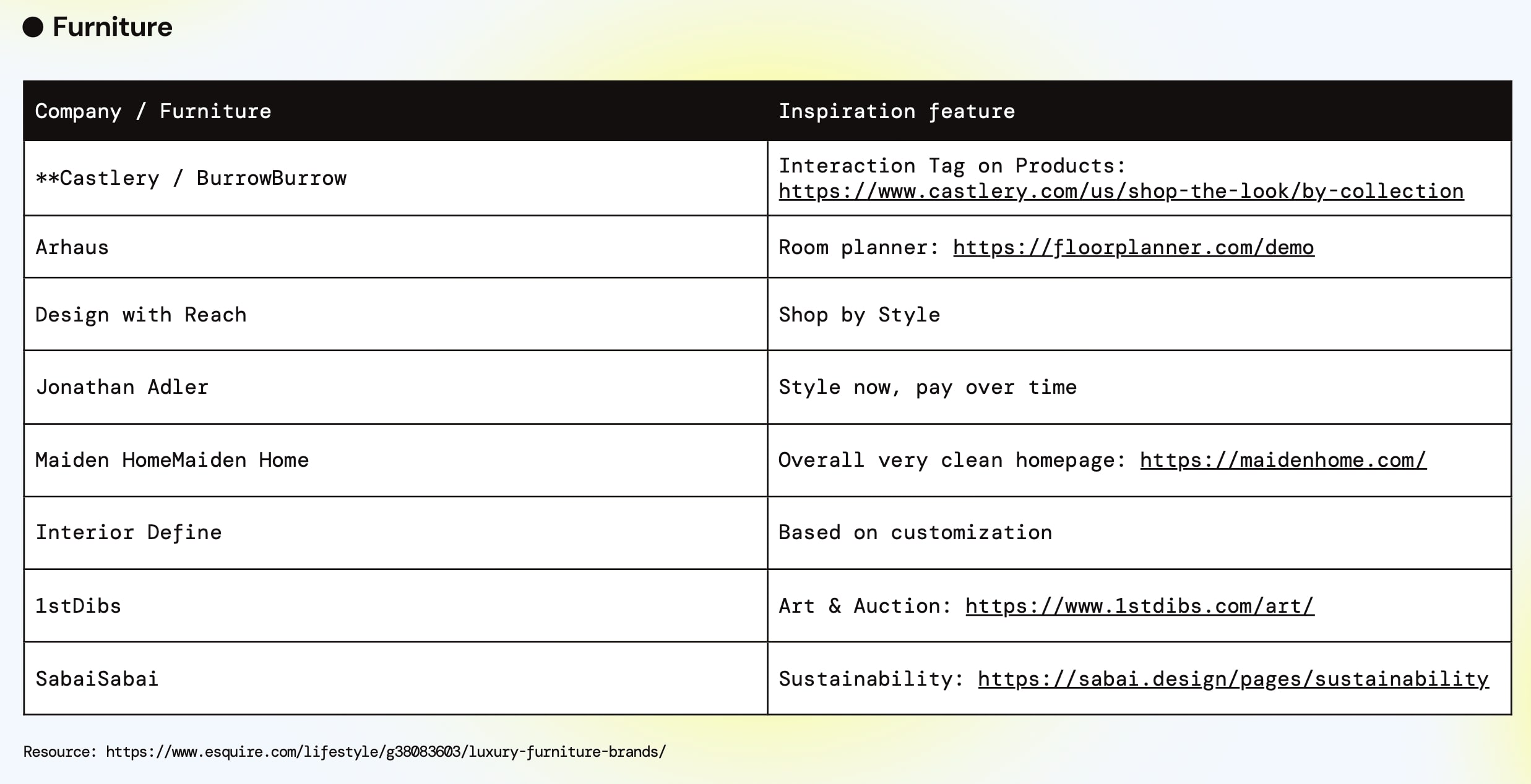
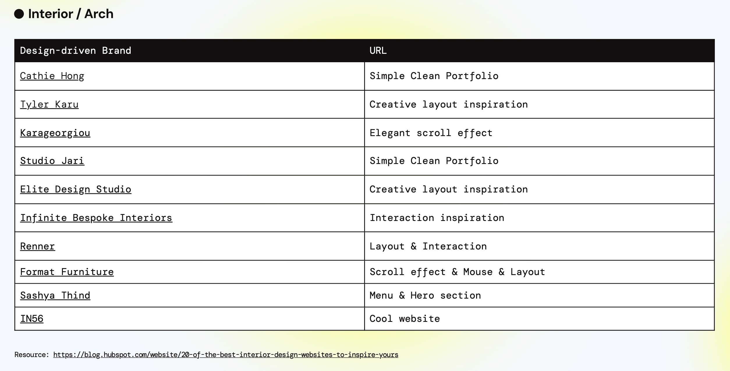
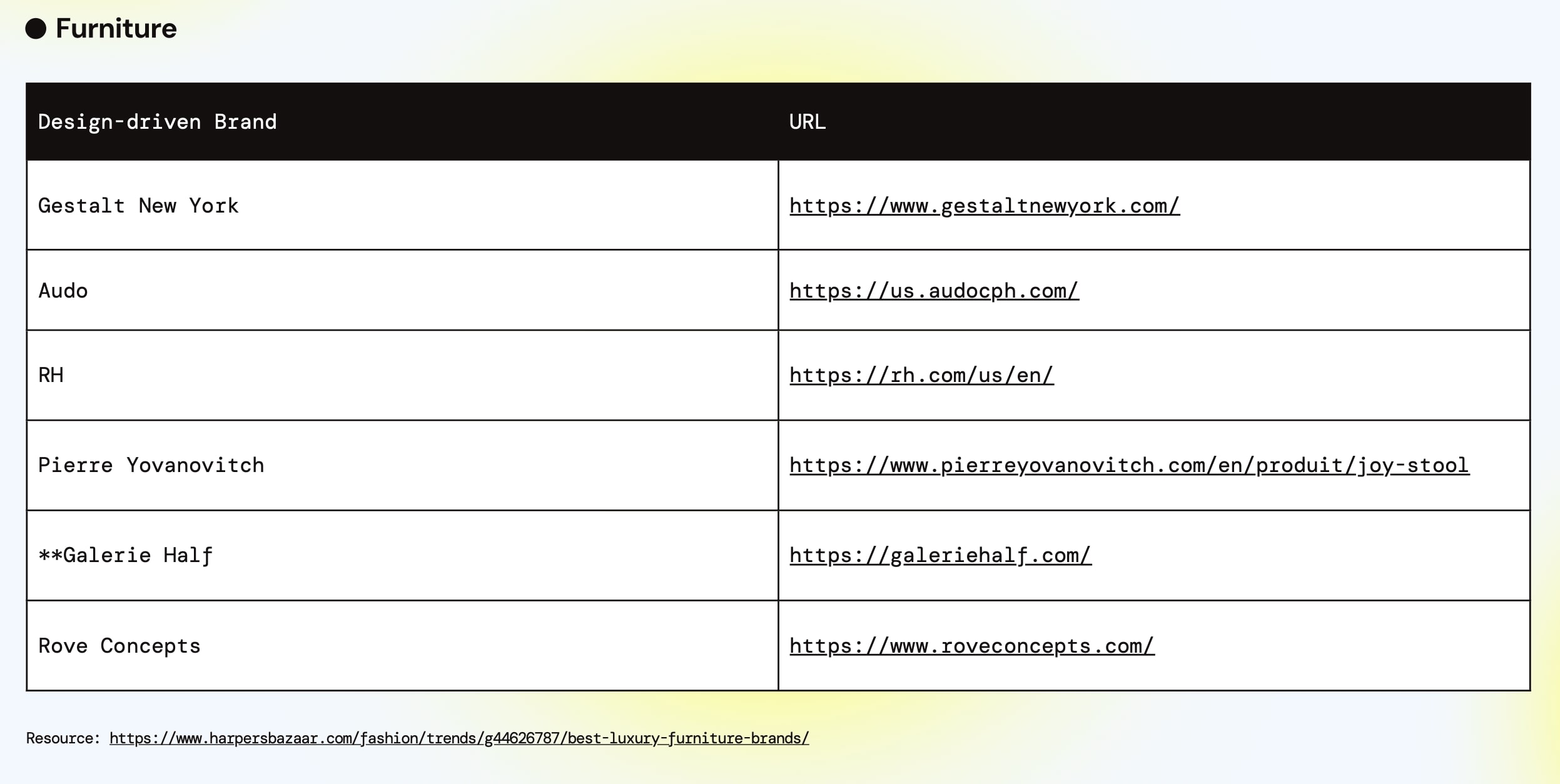
I browsed a few e-commerce website as well as simple furniture display website as inspiration for the website’s modules.
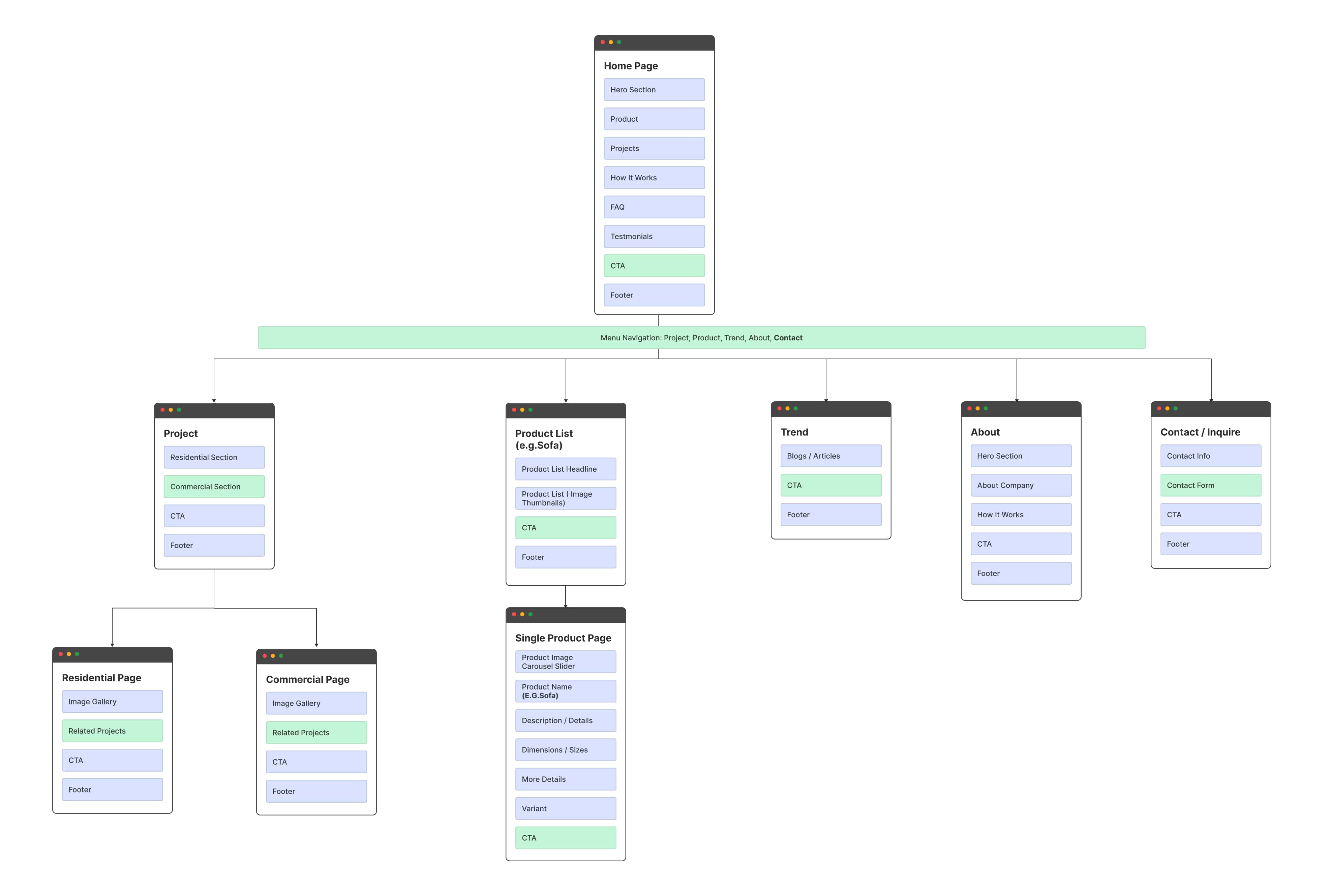
Sitemap:
The content in each home page section could be as few as possible to keep the page clean and use “view more” to expand to individual pages.
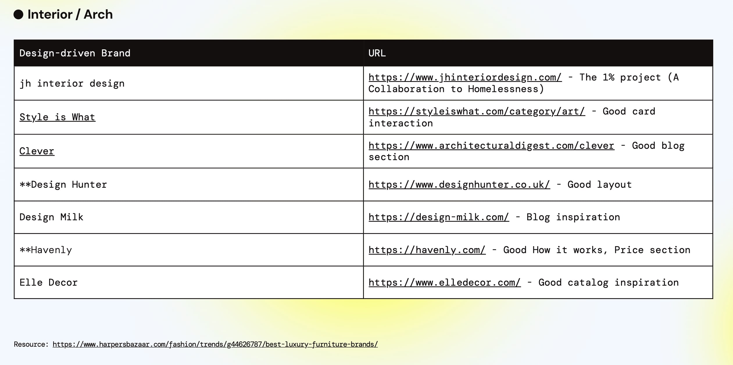
Competitors:
Design Process
Custom Web UI Design with Revisions in Figma:

Implementing the Relume kit offers a quick approach to developing an MVP model for the website. I provided the client with a low-fidelity wireframe mockup in Figma to give them a basic understanding of the website’s appearance and functionality.
Development in Webflow
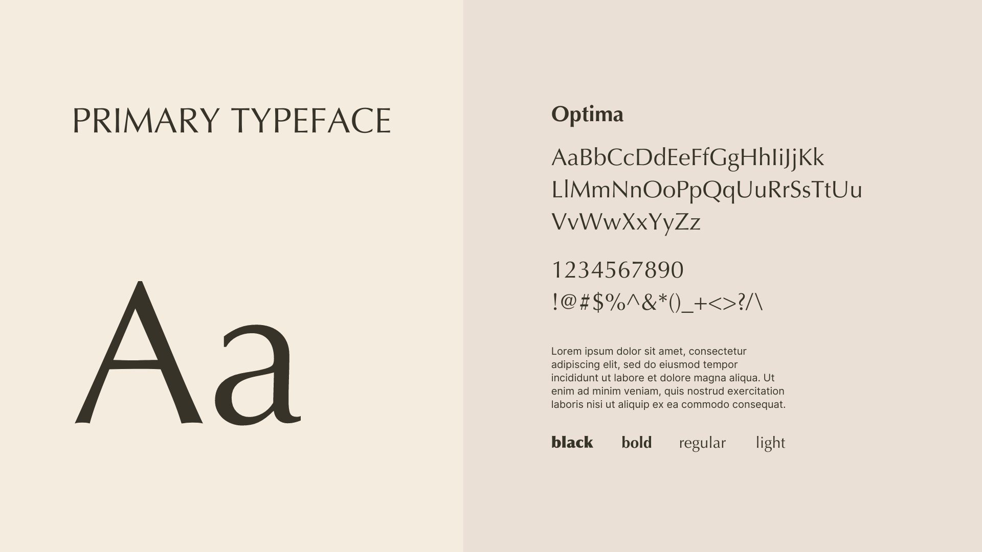
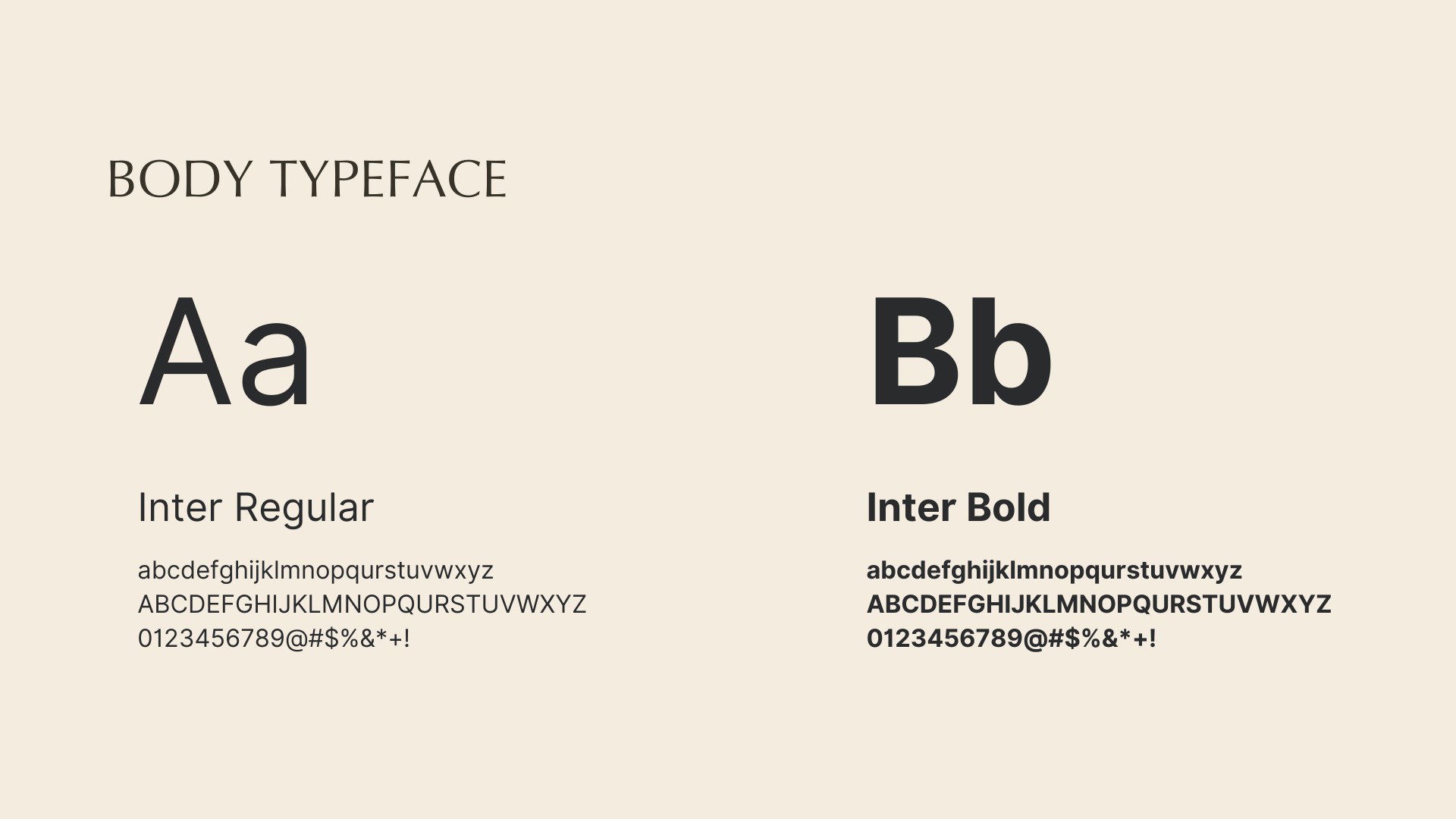
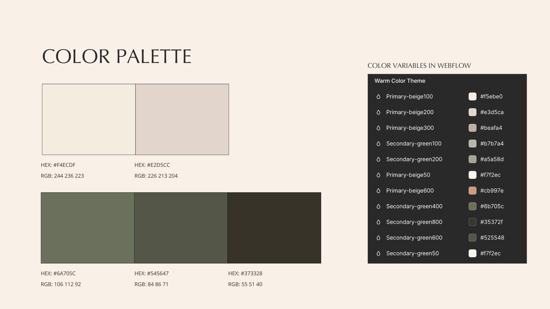
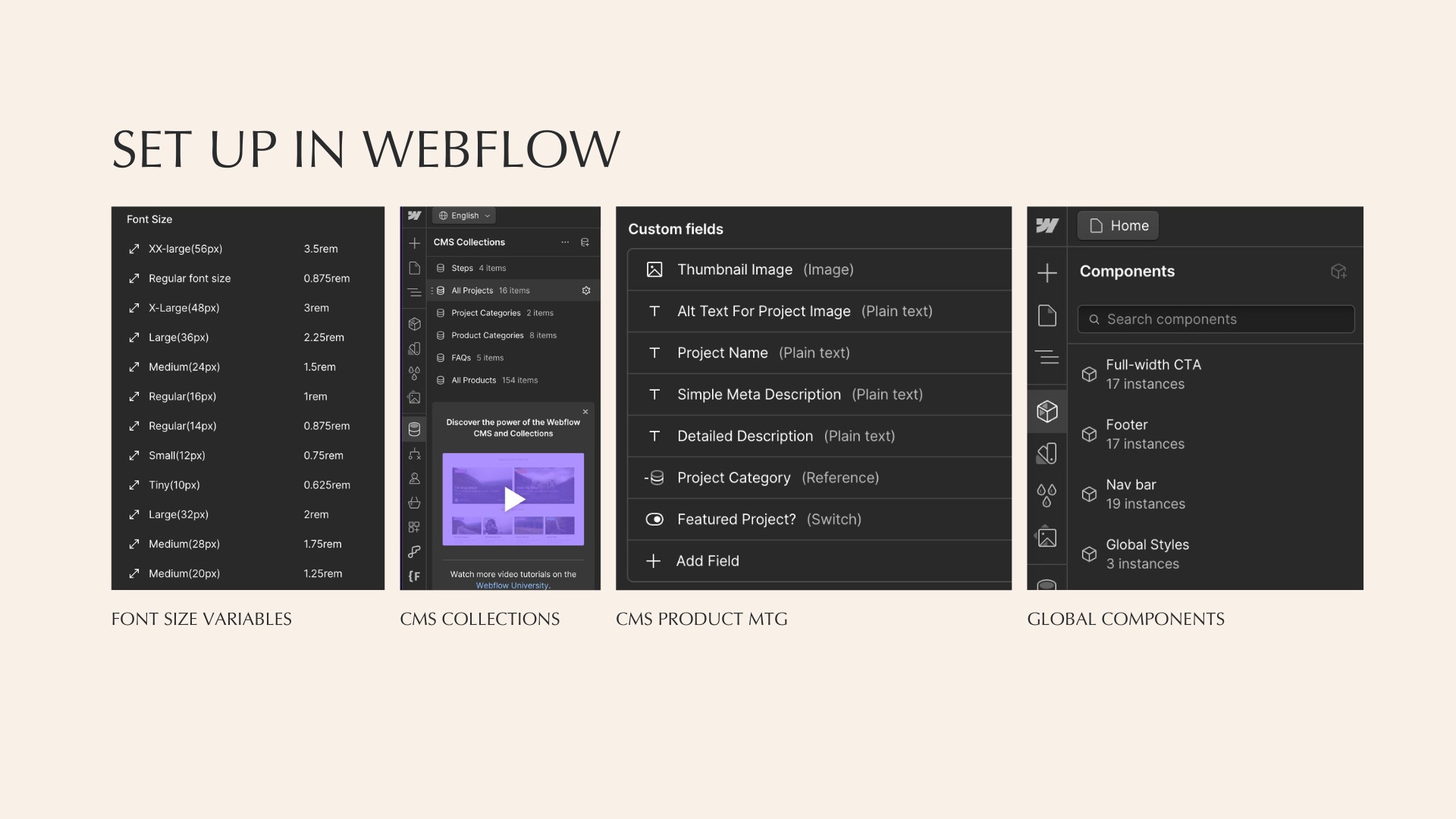
After implementing the first approved design in Webflow, I used the “design in code” process to continuously improve the design. Initially, according to the client’s request for a softer font and warm color scheme, I chose Optima font and a beige & green color combination for the starter brand guideline. I then set up the variables for font size and color grade in Webflow.

