Logo design
Gaia
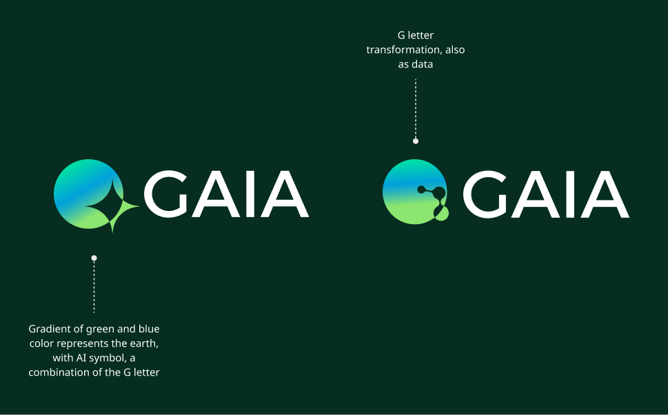
Gaia is a brand centered on geospatial data, machine learning, and artificial intelligence. The logo concept blends digital aesthetics with an environmental theme, representing the fusion of modern technology and earth conservation. The design incorporates earthy shades of green and blue to reflect this balance.
Deliverables:
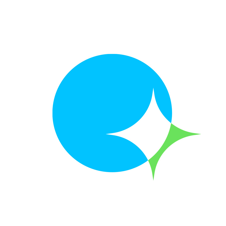
- Short Logo – A compact icon for profile pictures and app icons.
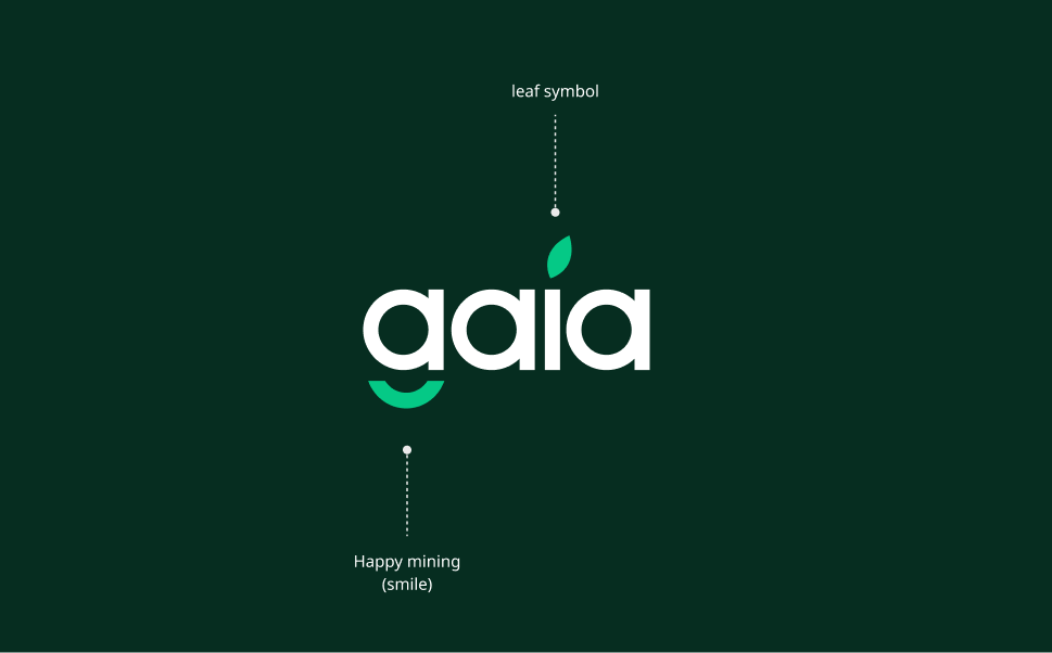
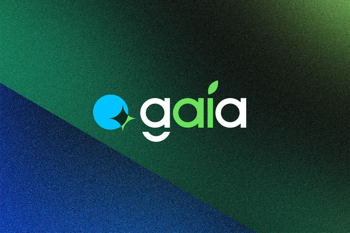
- Wordmark Logo – A full typographic design of “Gaia” with carefully selected typography and integrated visual elements.
Logo Intro
Brand Background
Gaia is a brand centered on geospatial data, machine learning, and artificial intelligence. The logo concept blends digital aesthetics with an environmental theme, representing the fusion of modern technology and earth conservation. The design incorporates earthy shades of green and blue to reflect this balance.
Deliverables:
- Short Logo – A compact icon for profile pictures and app icons.
- Wordmark Logo – A full typographic design of “Gaia” with carefully selected typography and integrated visual elements.
Logo Iteration V1
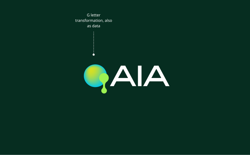
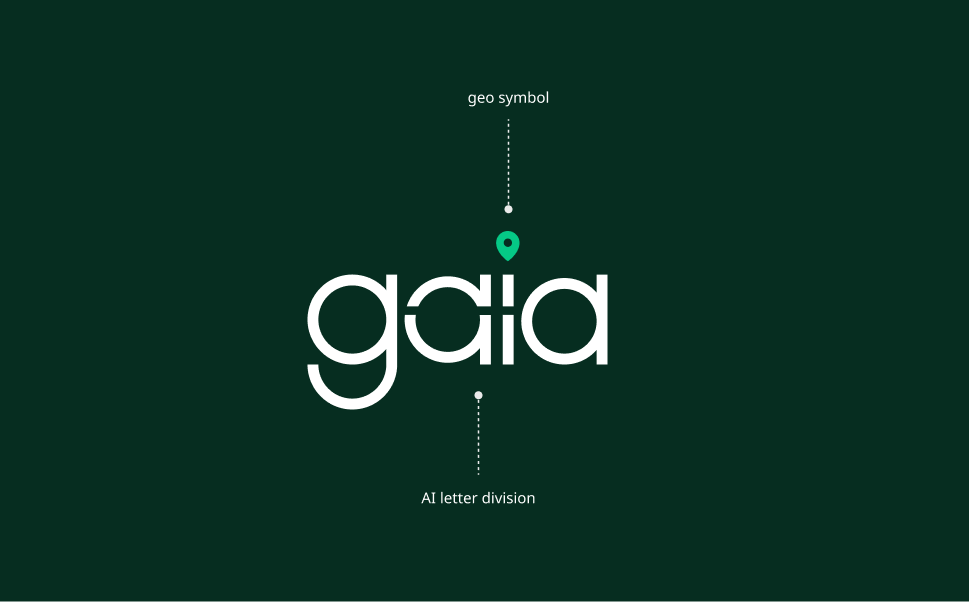
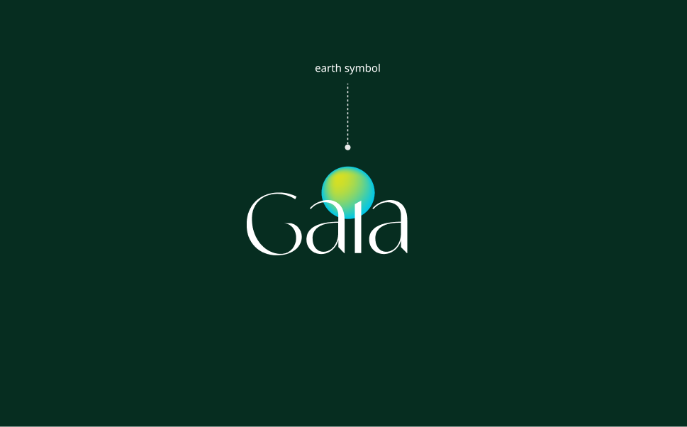
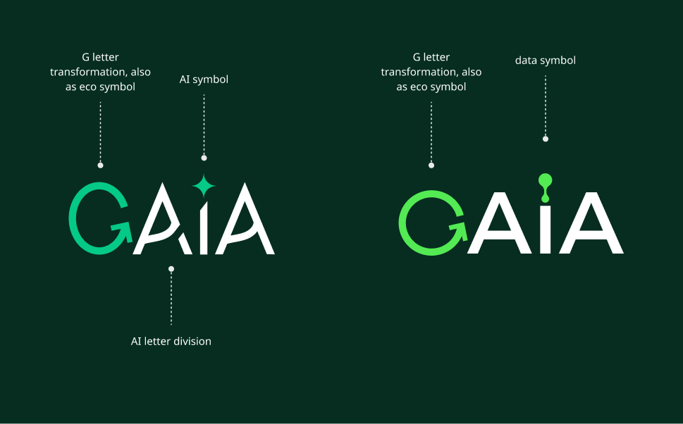
To brainstorm the Gaia logo, I explored a fusion of nature and technology by incorporating key elements such as geo icons, Earth, plants, leaves, water, and data-inspired visuals. Additionally, I experimented with different font variations to find a typeface that complements the brand’s balance between digital innovation and environmental conservation.

Logo Iteration V2
Logo Refinement
After selecting the strongest concepts, I refined the design based on feedback to enhance the balance between digital aesthetics and environmental symbolism. Key adjustments included:
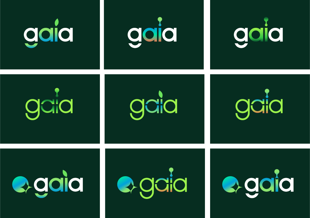
- Incorporating a green/blue gradient within the “ai” of Gaia.
- Introducing a clay/burnt sienna accent to enrich the color palette.
- Adding a water drop to the leaf on the “i” (or another element) to symbolize the oceans.
- Modifying the leaf design to differentiate it from Apple Inc.’s style.
- Exploring different typography variations for better alignment with the brand identity.
These refinements ensure a more cohesive and visually compelling representation of Gaia’s mission at the intersection of AI, geospatial data, and environmental conservation.
Final version
The client ultimately chose a clean and simple version of the Gaia logo, opting for a streamlined design without the green-blue gradient, clay accent, or water drop. This minimalist approach ensures clarity, versatility, and a modern aesthetic while still capturing Gaia’s core identity—bridging technology and environmental conservation. The refined typography and subtle natural elements create a strong, timeless brand presence.
