Logo design
Nextplace AI
For NextPlace AI, I designed a logo that reflects the brand’s focus on AI-driven location intelligence and predictive analytics. The design features a minimalist icon representing location and movement, paired with a clean, modern wordmark. The color palette and typography align with the sleek, tech-focused aesthetic of the brand, ensuring the logo is versatile and recognizable across various platforms.
Logo Intro
Brand Background
The client seeks a professional and modern logo for NextPlace AI, a platform specializing in AI-driven location intelligence and predictive analytics. The logo should align with the sleek, futuristic aesthetic of the existing website, reflecting innovation, geospatial data, and advanced technology.
The design should be minimalist, clean, and data-centric, incorporating elements that represent movement, prediction, and artificial intelligence while maintaining a strong, professional identity. The client requests:
- A short logo (icon) suitable for profile images and app icons.
- A wordmark logo with “NextPlace AI” in a sophisticated, tech-forward typeface.
The final design should be versatile, scalable, and instantly recognizable, reinforcing NextPlace AI’s position as a leader in geospatial intelligence.
Logo Iteration V1
Logo Exploration
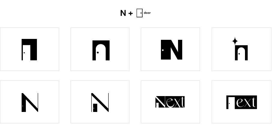
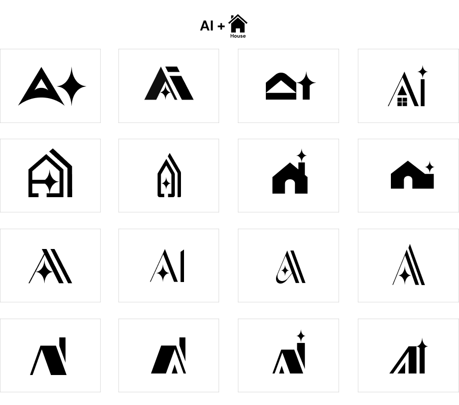
I explored multiple design concepts, including an ‘N’ with a door, ‘AI’ within a house icon, and a roof with a chimney.
Logo Iteration V2
Combination exploration brainstorm
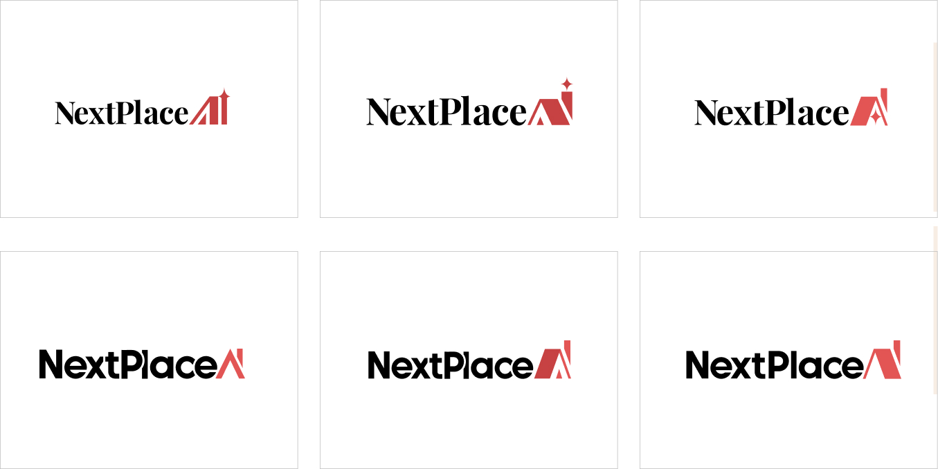
Based on the client’s Round 1 feedback, I explored different color options and font combinations to refine the brand’s identity, balancing modern, tech-driven aesthetics with versatility. I adjusted the AI symbol’s thickness for better cohesion with the typography and experimented with bold ideas to explore new possibilities.

After reviewing the door options, the client decided to drop the concept, as the logo already had enough elements. Here’s my Round 2 iteration:
- Typography Update – Testing bolder, more angular fonts for a futuristic, data-driven look.
- Capitalization Change – Adjusting to “NextPlace” with a capital ‘P’ for better readability.
- Symbol Refinement – Adding a minimal roof (/) over ‘AI’ to reinforce structure and innovation.
- Simplification – Removing the door for a cleaner, more streamlined design.
Additionally, while I tested Monserrat, the wide spacing of “NextPlace” felt less cohesive. Playfair Display had a strong look but is widely used, so I considered alternatives.
Final version
Logo Refinement
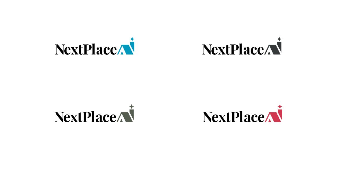
The client ultimately selected a clean, simple logo, featuring the Playfair Display font with the roof concept. They also requested four color variations, ensuring flexibility for use across different applications.
Color pallette
- Blue –
#64BBF1(Vibrant, tech-inspired accent) - Red –
#E25555(Bold contrast for energy and emphasis) - Ebony –
#555D50(Muted gray-green for subtle contrast) - Onyx –
#353839(Deep, neutral dark gray for a strong foundation)
An accessible color palette was chosen to align with Web Content Accessibility Guidelines (WCAG) for optimal readability and inclusivity.

Final version
